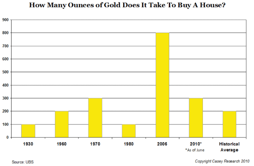
I've posted the occasional chart demonstrating this same relationship in the past. This one might be a little better. From Casey Research, which Im really starting to like a lot. Tags: Sometimes a chart is all you needJust Thinking ChronologyHousing CrisisHousesGold Log in or register to post comments


![[Most Recent Quotes from www.kitco.com]](http://www.kitconet.com/charts/metals/gold/t24_au_en_usoz_2.gif)


![[Most Recent Quotes from www.kitco.com]](http://www.kitconet.com/charts/metals/silver/t24_ag_en_usoz_2.gif)