People keep saying that they want that "National Conversation About Race". We are of the opinion that for the most part they're lying through their teeth. But just in case someone is telling the truth on that one, here's a good start.
As always, clicking on the chart will take you to it's source.
Black Americans at the median, earn less money than Asian Americans, White Americans, and American Hispanics, in that order.

Black Americans at every level of educational attainment suffer higher rates of unemployment than do White, Asian and Hispanic Americans.

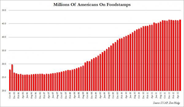
Apologists for Black America frequently site the statistical fact that there are more White Americans than Black Americans on the welfare rolls. The following is a chart reflecting that fact with regards to SNAP recipients.

Unknown?????
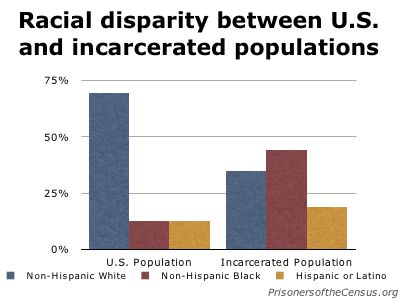
Apologists for Black America invariably fail to mention another statistical fact. Black Americans make up only about 13% of the total American population. As opposed to between 64% and 72% for White Americans, depending on your criteria regarding just exactly who is White.

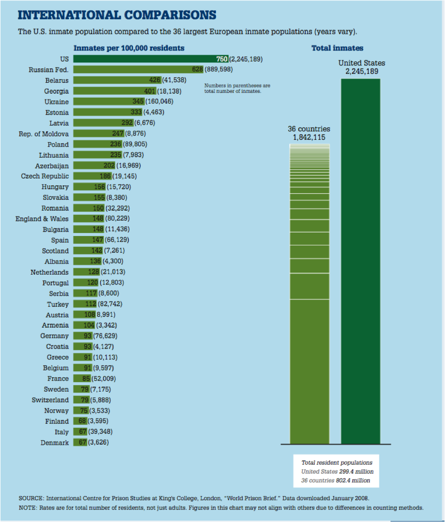
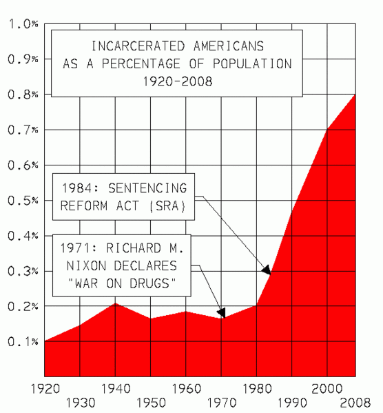
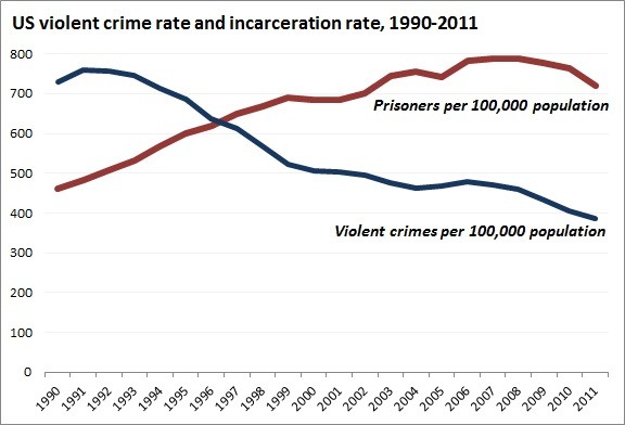
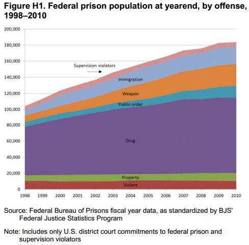
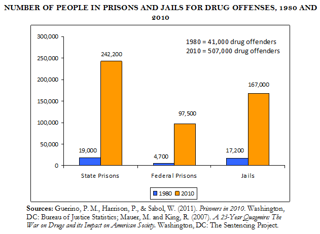
Black Americans are imprisoned at a significantly higher rate than are White Americans.


Again, apologists for Black America complain loudly that this disparity has to do with racist sentencing policies for possessing and selling illegal drugs, and in particular differences in sentencing across the board for use, possession, sale and distribution between crack and the powdered form of cocaine, Black Americans cocaine users being significantly more likely to indulge in Crack than are White American cocaine enthusiasts who prefer the powdered form.

They certainly have a point when it comes to the category "Street Level Dealer".

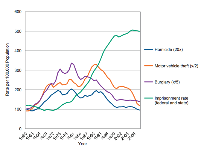
However, that Black Americans commit a significantly higher percentage of violent crime relative to their percentage of the total population than any other racial group in America is not even debatable. (FBI crime statistics combine Whites and Hispanics into the same group, called White)
Clicking on the image below will take you to the 2013 FBI Uniform Crime Report. It is important to understand that these statistics are for arrests and not for convictions. Having said that, the figures are truly ugly as Black Americans make up 52% of the arrests for Murder, 56% for Robbery, 33% for Aggravated Assault and with the exception of Driving Under the influence, Liquor Law violations and Public Drunkenness, Black Americans never approach their relative percentage of 13% of America's total population. Interestingly, 36% of the total arrests for "Suspicion" and 44% of all arrests for Curfew Violations and Loitering are made on Black Americans which I think can be easily construed as evidence of the pervasive "Arrested for Driving While Black" charge, registered by Black Americans against Police Departments across America for generations now.

BUT! .........................
What if maybe, all of this has nothing to do with race or racism or anything of the kind? What if there is something else at work here altogether?
The Right just loves to reference a 1990 report that has seemingly disappeared from the internet from The Progressive Policy Institute research arm of the Democratic Leadership Council that states as follows, “... the relationship between crime and one-parent families” is “so strong that controlling for family configuration erases the relationship between race and crime and between low-income and crime."
As early as 1965 New York Democrat, Senator Daniel Patrick Moynihan came to the identical conclusion in his report titled "The Negro Family: The Case For National Action. Office of Policy Planning and Research United States Department of Labor March 1965" aka "The Moynihan Report".
That report was for the most part vilified as both sexist and racist.
Results of a 1994 Wisconsin study on juvenile incarceration, based on data collected in 1993, when combined with census data for the state of Wisconsin from it's Current Population Survey for 1993, are as follows;

Additionally, children from biological two parent families on average miss fewer school days, have higher grade point averages, and are more likely to attend college. Of those who attend college, children from biological two parent families are more likely to graduate than children from both single parent families and children from biological/stepparent families.
Here is some of the research.
Test Scores: Elementary school children from intact biological families earn higher reading and math test scores than children in cohabiting and divorced single and always-single parent families. David J. Armor, Maximizing Intelligence (New Brunswick, NJ: Transaction Publishers, 2003): 80.
Test Scores: Adolescents from non-intact families have lower scores than their counterparts in intact married families on math, science, history, and reading tests. Youngmin Sun and Yuanzhang Li, "Parents' Marital Disruption and Its Uneven Effect on Children's Academic Performance- A Simulation Model," Social Science Research 37 (2008): 456.
Test Scores: Adolescents living in intact married families or married stepfamilies (with stepfathers) performed similarly on the Peabody Vocabulary Test, but adolescents living in single-mother families or in cohabiting stepfamilies (with their biological mother) did worse than those in intact families.Wendy Manning and Kathleen Lamb, "Adolescent Well-Being in Cohabitating, Married, and Single-Parent Families," Journal of Marriage and Family 65 (November 2003): 876-893.
Grades: High school students who live in intact married families have a higher average combined GPA in English and math (2.9) than those in married stepfamilies, divorced families, or intact cohabiting families (2.6) and those in always-single parent families or cohabiting stepfamilies (2.5). National Longitudinal Study of Adolescent Health. As cited by Patrick F. Fagan, "Family Structure and School Performance of U.S. High School Students." Available at http://www.frc.org/content/mapping-america-family-structure-and-school-p.... Accessed 12 September 2011 .
Attending College: Over 57 percent of children who live in intact biological families enter college, compared to 32.5 percent of children in stepfamilies, 47.5 percent of children in single-parent families, and 31.8 percent of children who live in families without either parent present.Gary D. Sandefur, Sara McLanahan, and Roger A. Wojtkiewicz, "The Effects of Parental Marital Status during Adolescence on High School Graduation," Social Forces 71, no. 1 (1992): 112.
College Graduation: Students from disrupted families are less likely to complete four-year college than their peers from intact biological families. Michele Ver Ploeg, "Children from Disrupted Families as Adults: Family Structure, College Attendance and College Completion," Economics of Education Review 21, no. 2 (2002): 174.
Overall: Adolescents from single-parent families and cohabiting families are more likely to have low achievement scores, lower expectations for college, lower grades, and higher dropout rates than children from intact biological families (after controlling for other family socioeconomic factors).Sara McLanahan and Gary Sandefur, Growing Up with a Single Parent: What Hurts, What Helps (Cambridge, MA: Harvard University Press, 1994): 79.
Behavior: First grade students born to married mothers are less likely to behave disruptively (i.e. disobey a teacher, be aggressive with other children) than those born to single or cohabiting mothers. Shannon E. Cavanagh and Aletha C. Houston, "Family Instability and Children's Early Problem Behavior," Social Forces 85, no. 1 (September 2006): 551-581.
Suspension: Adolescents in single-parent families, married stepfamilies, or cohabiting stepfamilies are more likely than adolescents in intact married families to have ever been suspended or expelled from school, to have participated in delinquent activities, and to have problems getting along with teachers, doing homework, and paying attention in school.Wendy Manning and Kathleen Lamb, "Adolescent Well-Being in Cohabiting, Married, and Single-Parent Families," Journal of Marriage and Family 65 (November 2003): 876-893
Attendance: Compared to adolescents from intact married families, those from divorced families and cohabiting families have many more unexcused absences and skip more classes.Barry D. Ham, "The Effects of Divorce on the Academic Achievement of High School Seniors," Journal of Divorce and Remarriage 38, no. 3 (2003): 180.Dropping Out: Students from stepfamilies and single-parent families are three times as likely to drop out of school as students from intact biological families, even when controlling for socioeconomic status.[13]
Dropping Out: Students from stepfamilies and single-parent families are three times as likely to drop out of school as students from intact biological families, even when controlling for socioeconomic status.Herbert Zimiles and Valerie E. Lee, "Adolescent Family Structure and Educational Progress," Developmental Psychology 27, no. 2 (1991): 314-320.
High School Graduation: Eighty-five percent of adolescents in intact biological families graduate from high school, compared to 67.2 percent in single-parent families, 65.4 percent in stepfamilies, and 51.9 percent who live with no parents. Gary D. Sandefur, Sara McLanahan, and Roger A. Wojtkiewicz, "The Effects of Parental Marital Status during Adolescence on High School Graduation," Social Forces 71, no. 1 (1992): 112.
Applying to College: Sixty-nine percent of children from intact biological families applied to college, according to one study, compared to only 60 percent of students who were not from intact families. Gary D. Sandefur, Sara McLanahan, and Roger A. Wojtkiewicz, "The Effects of Parental Marital Status during Adolescence on High School Graduation," Social Forces 71, no. 1 (1992): 112.
Educational Expectations: The adolescent children of single-parent families or stepfamilies reported that their parents had lower educational expectations for them, were less likely to monitor schoolwork, and supervised social activities less than the parents of children in intact biological families. Nan M. Astone and Sara S. McLanahan, "Family Structure, Parental Practices, and High School Completion," American Sociological Review 56 (1991): 309-320.
College Expectations: Whereas 31.3 percent of sons and 26.7 percent of daughters from intact biological families plan to get a college degree, 42.4 percent of sons and 35.9 percent of daughters in single-parent families do not plan to get a college degree. Rashmi Garg, Stella Melanson, and Elizabeth Levin, "Educational Aspirations of Male and Female Adolescents from Single-Parent and Two Biological Parent Families: A Comparison of Influential Factors," Journal of Youth and Adolescence 36 (2007): 1010-1023.
Parental Expectations: Sixty percent of mothers in intact married families expected their child to graduate college, compared to 40 percent of mothers in cohabiting stepfamilies and 36 percent of always-single mothers. Kelly R. Raley, Michelle L. Frisco, and Elizabeth Wildsmith, "Maternal Cohabitation and Educational Success," Sociology of Education 78, no. 2 (2005): 151.
Graduate Studies Expectations: About 40 percent of sons and 44.7 percent of daughters from intact biological families aim to get more education after obtaining their undergraduate degree, compared to 30.7 percent of sons and 35.3 percent of daughters from single-parent families. Rashmi Garg, Stella Melanson, and Elizabeth Levin, "Educational Aspirations of Male and Female Adolescents from Single-Parent and Two Biological Parent Families: A Comparison of Influential Factors," Journal of Youth and Adolescence 36, no. 8 (2007): 1017.
That there was some of the research.
Can anyone here possibly think that any of the above does not reflect in the potential for the lifetime earnings of an individual child? This matters a great deal because as you will discover below, this problem amplifies itself with every subsequent generation.
From Fair Test, College Board and the Wall Street Journal. Evidently, on average, children from every single economic bracket outscored every single lower bracket in every category on the 2014 SAT exam.
You really should read that again !!!!!!!!!!!!!


Now here's where it gets really interesting ..... at least to me.
It literally pays to be married as .....
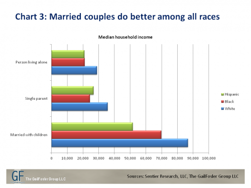
And ...

Conversly.

Don't just get caught up with the 48% "Never married", take note of the only 13% "Married with husband present" as well.
Seemingly, as John Wooden once famously said,

As an aside, I think that one might logically conclude that this would apply to women and fathers equally well.
But the children of Black Americans by a very strong percentage do not live in two parent families.

Or, the other way to look at it.

Feel free to draw your own conclusions here, but mine are as follows.
While it may not solve the entirety our issues with race in America, Black Americans in general and black American children in particular would be a helluva lot better off if black men and women were to get ..... not necessarily to each other ..... and then stay ..... MARRIED.
This pretty much goes for just about everyone else as well.
Just sayin'.


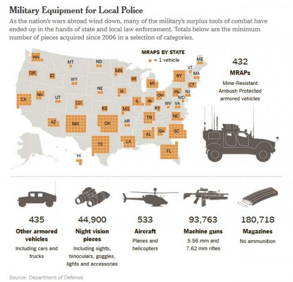

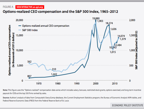
 and
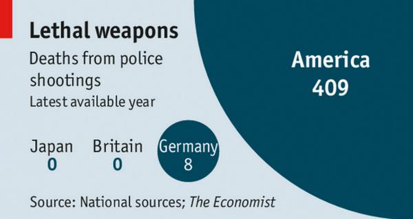
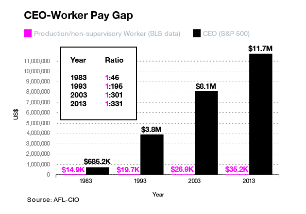
and 


![[Most Recent Quotes from www.kitco.com]](http://www.kitconet.com/charts/metals/gold/t24_au_en_usoz_2.gif)


![[Most Recent Quotes from www.kitco.com]](http://www.kitconet.com/charts/metals/silver/t24_ag_en_usoz_2.gif)