You are here

Sometimes a chart is all you need

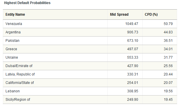
California breaks into the top ten

Submitted by Roanman on Fri, 05/14/2010 - 06:07


According to CMAVision.com.

Joining Venezuela, Argentina, and Greece among other notable bastions of fiscal responsibility, California sprints into the top ten list of likely international deadbeats with a very impressive 20% probability of default.

Can Sam be far behind?

Not a chance!!!!!

Owning your own printing press is a good thing ... for everyone but savers.


Dow to Gold Ratio

Submitted by Roanman on Fri, 05/07/2010 - 06:18


Fred's Intelligent Bear keeps a nice set of charts offering a more sober viewpoint than you'll get from CNBC.

Here's the chart that makes me go all warm and fuzzy.

After yesterday's debacle it was the first thing I wanted to see this AM.

The Dow/Gold Ratio.

Up is good for Stocks, down is good for Gold.


Housing/Gold

Submitted by Roanman on Sun, 04/25/2010 - 15:55


Chart of the Day strikes again.

The following chart presents the median single-family home price divided by the price of one ounce of gold.

This results in the home/gold ratio or the cost of the median single-family home in ounces of gold.

For example, it currently takes 153 ounces of gold to buy the median single-family home.

Considerably less that the 601 ounces it took back in 2001.

When priced in gold, the median single-family home is down 75% from its 2001 peak.

Click on the chart to go to Chart of the Day site.

Recommended.


The Shiller P/E Ratio

Submitted by Roanman on Thu, 04/08/2010 - 15:30


Professor Robert Shiller (Yale) is probably best known for his book "Irrational Exuberance" and the "Case-Shiller US Home Price Index he developed with Professor Karl Case (Wellesley) .

In his spare time, he came up with the Shiller P/E ratio.

The Shiller P/E ratio is calculated as follows: divide the S&P 500 by the average inflation-adjusted earnings from the previous 10 years.

Got that?

Don't worry about it.

Up is good if you're selling stocks.

Down is good when you're buying.

The chart below was taken from an article at The Daily Reckoning written by Dan Amoss having to do with a speech given March 24, 2010 by Russell Napier of CLSA (no clue) at the CFA Society (Certified Financial Analyst).

Excerpts from this most quotable speech, one of which I've posted below, are all over the place.

Recommended. 

The following chart from The Seeker Blog shows the same chart with it's historic average in red.


Ten Year Treasury Hits 4%

Submitted by Roanman on Tue, 04/06/2010 - 07:45


Four different services hit my mailbox last night with the same headline.

Ten Year Treasury Hits 4%

Putting aside the notion that a 4% yield over the next 10 years lent to anybody (let alone the Federal Government of the United States of America) even approaches a reasonable compensation for risk.

The much referenced "Head and Shoulder" Top is in.

My preference would be for it to go back up and close that gap between about 118.3 and 117.5 and then finish.

As a matter of fact, I believe it will, only because I have come to the conclusion that the notion of randomness in the world is a deception.

I have come to believe that the world is just about as anal and rhythmic as I am (which is pretty damn).

I also believe that the Fed will use every lever to hold rates down.

I'm just not sure it's gonna work.


Savers may not be gasping for income that much longer.

Oh yeah, and P.S.

Did you make that refi application yet?


Still Reading on a Sunday Morning

Submitted by Roanman on Sun, 03/28/2010 - 14:59

Pages

Subscribe to RSS - Sometimes a chart is all you need