You are here

Sometimes a chart is all you need

All the World's Gold

Submitted by Roanman on Tue, 01/17/2012 - 18:02


This "info graphic" was sent to us in response to this morning's post from the same info address that sent us the Beatles vid.

Whoever you are, keep up the good work.

The following is from Numbersleuth which is a new site to us.

The thing is a little busy maybe but jam packed with just the kind of useless information we love to whip out at parties in an effort to make people thinnk we're a whole lot smarter than we really are.

Click anywhere below for a much larger/easier to read version.


All The World's Gold
From: Number Sleuth

Historic Interest Rates

Submitted by Roanman on Sat, 01/07/2012 - 07:16


From Bianco Research who claim "more than 300 institutional clients worldwide including official government agencies, central banks, public and private pension plans, institutional money managers and hedge funds".

Which claim has caused me to never bother pricing them out.

Take note of the year 1916 which incorrectly holds the line marking the creation of the Federal Reserve Bank.

The New York offices of which are the official summer home of Satan himself and the source of all evil in this world.

The Federal Reserve Act was voted into existence December 23, 1913.

Click on the chart if you have an interest in pricing out Bianco Research, someone around here might partner up with you.


Take a hard look at 1940 through 1984 if you own or are planning to own bonds anytime soon.

The value of your bonds rise as interest rates fall, and subsequently fall as interest rates rise.


The 2010 World Corruption Perceptions Index

Submitted by Roanman on Sat, 12/03/2011 - 10:59


Transparency International has released it's 2010 Corruption Perceptions Index.

The results as always are interesting ... at least to us.

One must understand that this index is based on a methodology wherein the "perception" of a nations public sector corruption is measured, rather than some defined measure of corruption itself.

We read through the methodology section and have had very few quibbles and as a result are mostly buying it.

As always click on the map below for TI's complete list.

We would encourage you to spend a minute with Transparency International's fine site as we always find it to be well worth the time.


Tsk, Tsk, USA.


The EU debt crisis in one graphic

Submitted by Roanman on Tue, 11/01/2011 - 07:15


From Charles Hugh Smith's fine site Of Two Minds.

Click the dominoes for the accomanying analysis.


As an aside, the Maastrict Treaty also known as the "Treaty Of The European Union" became effective on this date in 1993.


USE REAL NUMBERS!!!!!!!!!!

Submitted by Roanman on Wed, 08/24/2011 - 07:53


If you remember from prior posts, there have been changes made over time to both the calculations the government uses to measure inflation, and those it employs to measure unemployment.

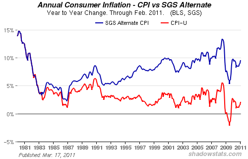
On second thought, you don't have to remember.  Here's the link to our post and here's the chart that was included in that post.


All of these changes have been specifically designed to lower the numbers for inflation and unemployment in a deliberate effort to deceive the public with regards to the true economic condition of the country.

And because the government's numbers are designed to deceive, they naturally fly in the face of the everyday citizen's everyday experience.

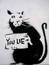
The result of course being that while people don't for the most part understand the specifics of what is going on, they do know that the numbers the government touts in an effort to sell a program or justify it's existance are under the best of circumstances wrong or worse (and IMHO) a bald faced lie.

The further result of course being that people view their government as, under the best of circumstances an incompetant joke, or (and IMHO) a lying incompetant joke.

Even your garden variety public school dropout who probably couldn't even begin to tell you how a percentage is calculated, intuitively understands that if CPI is the measure of how much the price of stuff is going up, then two is way too low a number.

The final further result of course being that people come to understand that if they can't trust the numbers the government pushes out there every single day as fact, they can't trust anything the government has to say on any issue.

And when I say anything, I mean everything, from 9/11 commisions to anything you might care to ponder.

Which is exactly the situation we find ourselves in at this very instant.

So .........

If you want to actually fix this mess, the place to start is to go back to the original method for measuring unemployment and the CPI.

While those calculations may not be perfect, they will serve us well by accurately defining where we are in comparison to where we have been, and in doing so will represent the first tentative steps toward establishing an honest federal government.


OK, OK a more honest federal government.


Sometimes a list is all you need

Submitted by Roanman on Fri, 08/19/2011 - 06:22


Your government along with the Fed, which is not your government it merely owns your government, has been telling you that inflation is only about 3.5%

The following is from Greg Hunter at USAWatchdog.com, who links you up with  TheBurningPlatform.com for additional (slightly more analytical while at the same time significantly more pissed off) analysis.


Ben Bernanke announced his QE2 policy in August 2010.

Here are your results:


•Unleaded gas prices are up 45%.

•Heating oil prices are up 46%

•Corn prices are up 71%

•Soybean prices are up 26%

•Rice prices are up 13%.

•Pork prices are up 31%

•Beef prices are up 25%

•Coffee prices are up 38%

•Sugar prices are up 48%

•Cotton prices are up 13%.

•Gold prices are up 42%.

•Silver prices are up 115%.

•Copper prices are up 23%


Forget about that, you don't use most of that stuff anyway.


What I been sayin'.

Submitted by Roanman on Tue, 08/16/2011 - 08:26


This chart was published at McMaster Online but it was constucted at Stockcharts.com.

If you like charts, and sometimes a chart is all you need, Stockcharts is the place for easy to construct financial charting.

And finally, that thing I've been sayin' now for quite some time,

BUY GOLD!!!!!!!!!


Sometimes a chart ..... you know the rest

Submitted by Roanman on Mon, 08/01/2011 - 21:14


I'll say it again, Jesse's Cafe Americain while not always the easiest site to digest, continues to be among the most informative and usefull sites anywhere on the net.

After a week of nonsense within the halls of Congress, The Whitehouse and especially on your TV, here's Jesse with one timely chart that explains it all.


Buy Gold!!!!!


Pages

Subscribe to RSS - Sometimes a chart is all you need