WHAT I"VE BEEN SAYIN'!!!!!!!
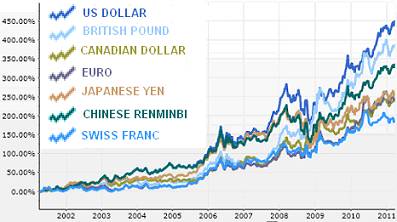
From Kevin McElroy for Wyatt Investment Research.
Click the chart above for the story.
- Read more about WHAT I"VE BEEN SAYIN'!!!!!!!
- Log in or register to post comments
From Kevin McElroy for Wyatt Investment Research.
Click the chart above for the story.
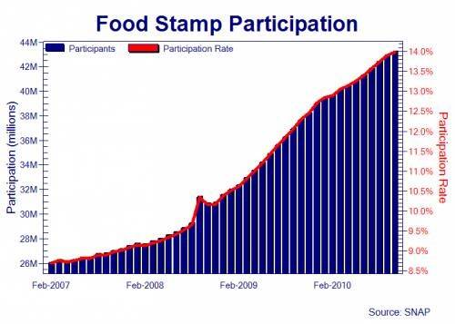
From the USDA's ![]() Supplemental Nutrition Assistance Program
Supplemental Nutrition Assistance Program
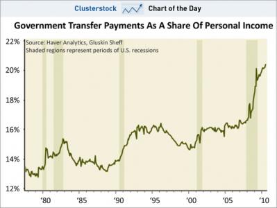
From Business Insider Clusterstock Chart of the Day![]()
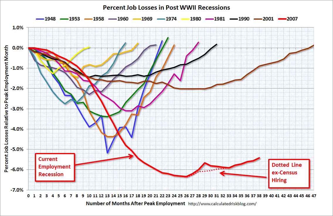
From Calculated Risk![]()
Prodded by Mitch Albom, Jeff Daniels, and Mike Binder among others, the state of Michigan under the Granholm administration, passed a program offering tax credits to the entertaiment industry in an effort to induce producers to do business creating product in the state of Michigan.
This program included a 40% refundable tax credit as revealed below in the "Fast Facts" taken directly from the ![]() Michigan Film Office's web page.
Michigan Film Office's web page.
Minimum spend of at least $50,000 in Michigan to be eligible.
40% refundable tax credit, across the board on Michigan expenditures.
Claim an extra 2% if filming in one of the 136 Core Communities in Michigan (click the link to download and print a map of the core communities).
Labor and Crew: 40%-42% Resident Below the Line. 40%-42% Above the Line regardless of residency. 30% Non-resident Below the Line.
$2 million salary cap per employee per production. There is no other cap and no sunset.
All applicants can expect a 4 week review process once all materials have been received.
Must spend at least $500,000 annually in Michigan to be eligible for an interactive web site project.
By anyone's standard, the program has been a success at bringing projects to the state of Michigan.
Among the "feature films" shot in the state of Michigan are Clint Eastwood's Gran Torino, Michael Moore's Capitalism, a Love Strory , and Up in the Air starring George Clooney (which by the way, I really, really liked) among others.
George Clooney is back in town as I type this, working on something.
Michigan's new governor, Rick Snyder has proposed a drastic reduction in the total amount available for this tax credit program and in so doing has raised the ire of Mitch Albom among others who correctly (I think) contend that movie productions and jobs won't come to Michigan without favored tax treatment.
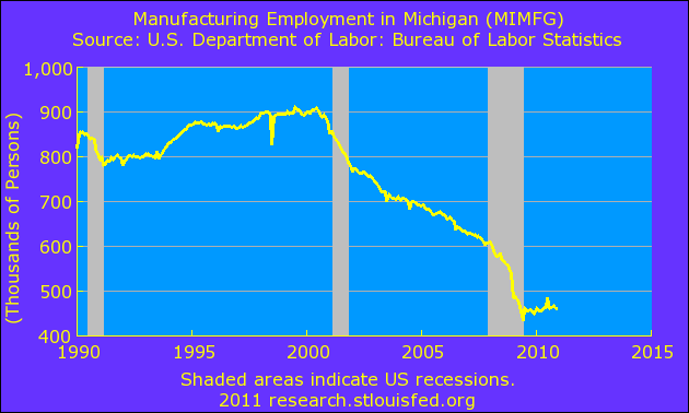
The below is a chart from the St. Louis Federal Reserve Bank which demonstrates Michigan's loss of some 400,000 manufacturing jobs during the first decade of the 21st century.
Ok, so here's my question.
To my knowledge, which I will admit to being incomplete on this issue, Mitch Albom, Jeff Daniels, Mike Binder and Michael Moore have never advocated for anything approaching a 40+% "across the board tax credit on all Michigan expenditures" for anyone other than themselves via their industry.
If this idea is working so well when it comes to the movie business, why wouldn't it work equally well attracting business in industries where all the infrastructure, buildings, equipment and a trained up and highly skilled labor force, in other words the whole enchilada ..... IS ALREADY IN PLACE?
Why aren't these guys advocating this kind of a program for everyone?
Just askin'.
From the ![]() World Nuclear Association, by way of Casey Research
World Nuclear Association, by way of Casey Research![]() .
.
Nuclear electricity generation by country.
The width of the bar signifies the relative total electricity within each country.
![]()
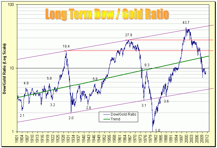
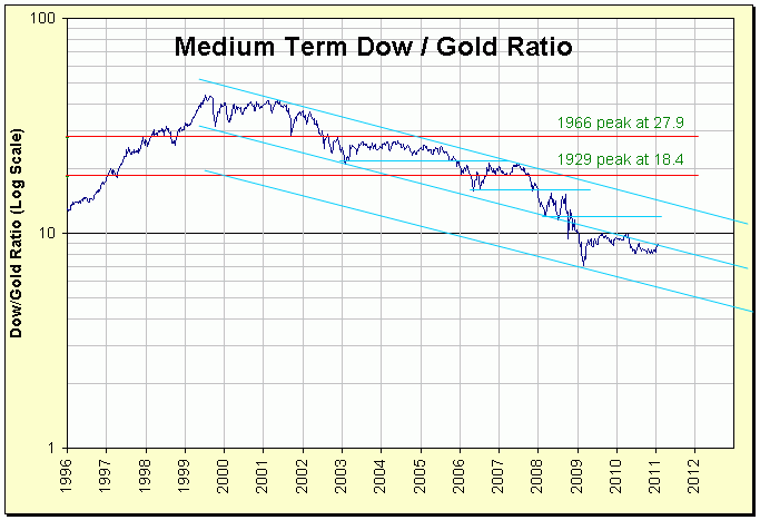
Since we updated our Housing over Gold post yesterday, might as well update the Dow Jones Industrial Average over Gold today.
Both charts are from Fred's Intelligent Bear, click either chart to access Fred's excellent if slow moving site.
Then just because we watch this thing without fail, every single time we cruise through Fred's site, here's the legendary John West Red Salmon commercial.
We've posted this chart two or three times over the past couple of years.
It's getting no better unless you're invested in Gold rather or in addition to a house.
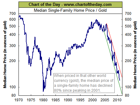
Click on the chart to go to Chart of the Day's page.
They're going to tell you that it presently takes 120oz of gold to buy the median single family house, in 2001 in took 600oz.
We think we're going to get the double bottom ..... or top, depending on your point of view, and are invested that way.
From Clusterstock ![]() Chart of the Day.
Chart of the Day.
Goldman Sachs enjoyed Sixty Eight (68) One Hundred Million Dollar ($100,000,000.00) days in 2010.
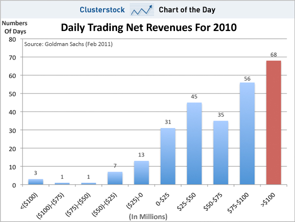
So ..... what have you been doing with your time?
We've got good news and bad news for you today ladies and gentlemen.
As always clicking on the charts will take you someplace really, really interesting.
First the good news.
Then the bad news.
The above, as stated previously![]() , being resultant of the following real, real bad news.
, being resultant of the following real, real bad news.
Which of course brings us to the extremely, exceptionally bad news.
Especially if you happen to be one of those people who work and save their money.
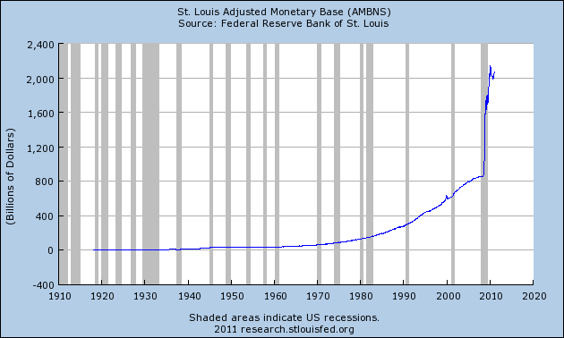
Bye the way, we're still over here trying to figure out the FED ............. seriously.
We've been trying to understand "The Fed"
To be perfectly honest about it, we still don't even know what we don't even know.
But as usual, this has not prevented us from having an opinion.
Adjusted Monetary Base is that part of the money supply that is most liquid, that which is either in the hands of the public (in circulation) or in the commercial bank deposits held within the central banks reserves.
The first chart demonstrates the growth of the Adjusted Monetary Base since 1918 or so, 5 years after the creation of The Federal Reserve Bank.
America's third central bank by the way.
More on that latter.
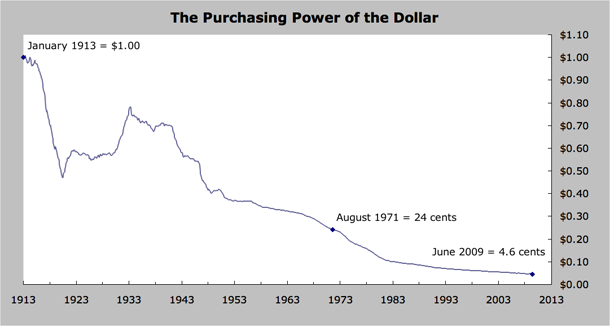
The second chart represents the purchasing power of One ($1.00) Dollar since the inception of The Federal Reserve Bank in 1913.
Click the chart below for some different looks at the same issue.
The following is taken directly from the Rules of Monopoly.
Don't believe me? Just click.


It really is time to lose the Fed.
MiseryIndex.us maintains a number of charts for the historic US Misery Index including monthly misery charts, comparative misery by President as well as by Congress along with individual charts for historic unemployment, and rate of inflation respectively.
The chart below displays yearly misery, or the lack thereof, by President.
Click on the chart below to reach MiseryIndex.us.
Not quite as miserable an experience as you might think.
Blue is unemployment, Red is inflation.
The misery index was initiated by economist Arthur Okun, an adviser to President Lyndon Johnson in the 1960's. It is simply the unemployment rate added to the inflation rate. It is assumed that both a higher rate of unemployment and a worsening of inflation both create economic and social costs for a country. A combination of rising inflation and more people out of work implies a deterioration in economic performance and a rise in the misery index.
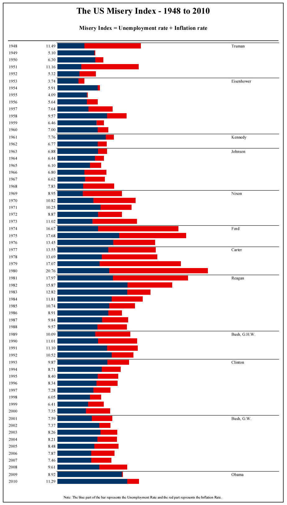
And the award for most miserable Presidency goes to ... in a landslide ... Jimmy Carter.
Which might explain why Mr. Carter is our single most miserable ex-President.


![[Most Recent Quotes from www.kitco.com]](http://www.kitconet.com/charts/metals/gold/t24_au_en_usoz_2.gif)


![[Most Recent Quotes from www.kitco.com]](http://www.kitconet.com/charts/metals/silver/t24_ag_en_usoz_2.gif)