To quote Lewis Mumford once again Tags: QuotesLewis MumfordJust Thinking Chronology Read more about To quote Lewis Mumford once again Log in or register to post comments
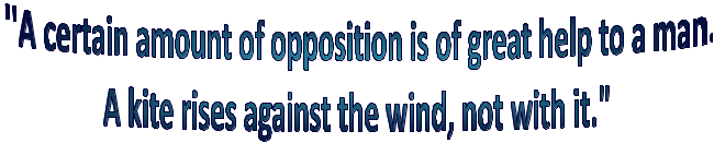
To quote Lewis Mumford Tags: Lewis MumfordQuotesJust Thinking ChronologyKites Read more about To quote Lewis Mumford Log in or register to post comments


![[Most Recent Quotes from www.kitco.com]](http://www.kitconet.com/charts/metals/gold/t24_au_en_usoz_2.gif)


![[Most Recent Quotes from www.kitco.com]](http://www.kitconet.com/charts/metals/silver/t24_ag_en_usoz_2.gif)