You are here

Sometimes a chart is all you need

Your pants are a liar.

Submitted by Roanman on Fri, 10/19/2012 - 06:27


Thanks to Jennifer N., Rodney T. and Tall Paul who are skulking either Esquire or Chartporn.

 I told you it was good.

It seems your pants are lying through their zipper about the size of your waistline.

Click on the chart for the article.


Damn, is all I gotta say.


More charts and stuff

Submitted by Roanman on Wed, 10/17/2012 - 07:59


On account of us having barely even put a dent in the pile of stuff we've collected recently, here's a little more.

Since it's the morning after the second debate between Barack Obama and Mitt Romney in their contest to determine the next President of the United States, and the subject of "taxing the rich" is bound to have come up, let's start with tax rates.

Romney's 2011 tax rate was significantly lower at about 13.6% than was Obama's at about 21%.

Romney's giving exceeds that of Obama by a score of 29% to 24%. 

At the risk of being accused of beating a dead horse, we think everybody should be paying the same rate after a substantial personal deduction and that charitable giving should only be an issue if some selfish little turd who gives next to nothing out of his personal account happens to be running for the office of Vice President.


We know this and are positive that you know it as well, but it is certainly worth repeating. 

Charts like statistics can be fudged, as is pointed out in these two views of America's 'housing recovery.


We posted these two a while back.

Both employment/population and the labor force participation rate of men are in serious decline.


Not to worry though as our government with money provided by the American people supplies many, many, many of our poorest and less fortunate souls with food, clothing and shelter in abundance.


The following depiction accurately ... we think ... conveys how we determine who it is that needs the most help providing for their own living arrangements.

Fair is fair.


And many Americans need this help as large percentages of the American people have less than a $100 cash reserve for emergencies.


Part of the problem might just be that the value of the unit in which people are getting paid, the dollar, declines in value year after year after year after year after ......

Yeah, yeah you've seen this one before.


While the rate of change in average hourly earnings is also in decline.


I believe that we have mentioned that those scalawags over there at the government are living large.


We're guessing that not one word of any of this with the exception of that "tax the rich" thing was mentioned last night.

Out of time ..... gotta scoot.


Sometimes some charts, a couple of cartoons and a photo or two are all you need.

Submitted by Roanman on Sun, 10/14/2012 - 12:41


We have got the stuff today as we've been collecting without a post for probably the better part of three weeks now.

So, in no particular order of importance,

Recent Natural Gas pricing offers a primer on the law of supply and demand as supply of Nat Gas drilling rigs rises and falls with the price of Nat Gas.  

Prices for Liquid Natural Gas swing wildly from continent to continent as intercontinental transport of Natural Gas remains difficult, expensive and likely dangerous.


Some people took a less serious approach to the Presidential debates than did others.


While President Obama's epic poor performance in the first debate may not cost him the Presidency it most certainly has destroyed what little confidence the country had left in the abilities of the Telestrator in Chief.


When The New Yorker is taking cover shots at a sitting Democrat President, you gotta think all credibility is lost.


Spain has moved past debate as it's rate of unemplyment moves into the mid 20s.  The real dark red in the map below is Spain for those of you who are geographically challenged.

The light blue smack in the middle of Europe is Germany, who I'm thinking would really like to stay that color.


"Recortes Son Necesarios" translates as "Cuts Are Necessary" in reference to austerity measures allegedly being implemented by the Spanish governmnent.

We trust you can grasp the meaning in the artwork.

Order yours here.


Unbelievably to us among many, the Nobel Committee awarded the Nobel Peace Prize to the European Union despite the violence captured in the photos below.

We happen to be very comfortable laying the blame for that violence directly at the feet of the European Union, among some others.


Which award following that for President Obama inspired the following special offer.


Speaking of unemployment, the Bureau of Labor Statistics reported that the unemployment rate has fallen from 8.1 % in August to 7.8% in September on the strength of some 870,000 plus new jobs 563,000 of which were part time.  

This number has been widely mocked as cooked.

While not evidence of cooking on the part of the Labor Department, the following chart of the September Monthly Change to Workers Aged 20-24 reveals the first and only increase in employment in 28 years.  

Each bar in the chart below represents a September of some year.

The fact is that September of 2012 is the first month in history that this age group has ever experienced an increase in employment during the month of September ...... you're gonna have to take our word on that last part as I can't find a chart that works.


As demonstrated in this next chart, the number of unemployed and underemployed people for the month of September increased from 25.8 million in August to 26.2 million in September.


I don't know what this has to do with anything, but I thought it to be interesting and saved it to whip out the next time there is an uncomfortable lull in the conversation at some cocktail party I may be attending.

From The Pew Forum.


Finally, because I'm out of both time and energy for the moment, that's it for now.

We finish today's report with the fundamental difference between Mom and Dad.


Charts upon charts upon charts upon ..... and a couple cartoons.

Submitted by Roanman on Fri, 09/14/2012 - 18:46


In 1977, Congress amended The Federal Reserve Act, stating the monetary policy objectives of the Federal Reserve to be as follows,

"The Board of Governors of the Federal Reserve System and the Federal Open Market Committee shall maintain long run growth of the monetary and credit aggregates commensurate with the economy's long run potential to increase production, so as to promote effectively the goals of maximum employment, stable prices and moderate long-term interest rates."

The notion that the Fed is tasked with promoting maximum employment and stable prices is what is frequently termed the Fed's "Dual Mandate".

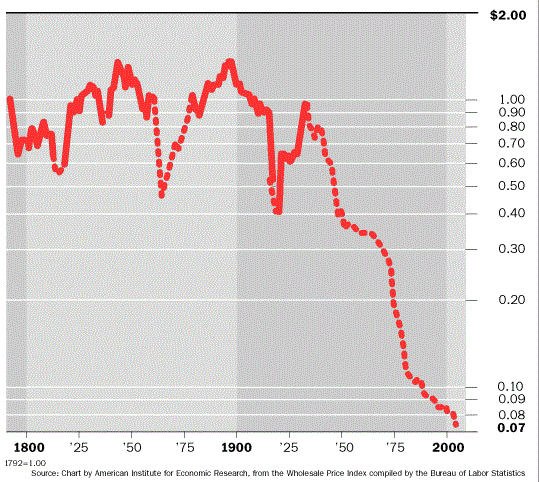
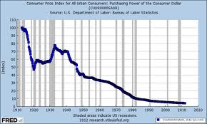
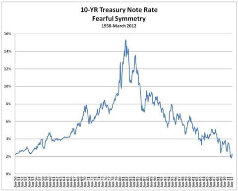
Having failed miserably throughout the entirety of it's charter (1913) to maintain stable prices, as the decline in the value of the dollar equals increased prices for everything other than a dollar.


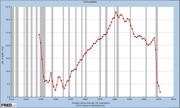
The purchasing power of the dollar 1792 - present, dotted lines signify those periods when convertability to gold was/is suspended.


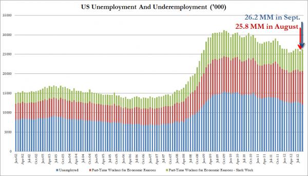
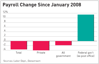
The Fed decided this week that they better address their almost equal fail with regards to maintaining full employment, on account of the following.  

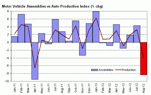
Things are not going swimmingly in Detroit.


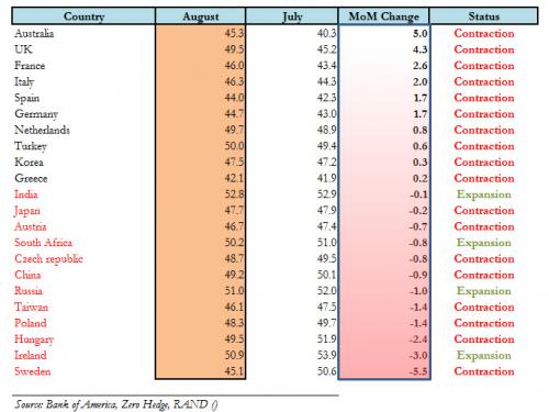
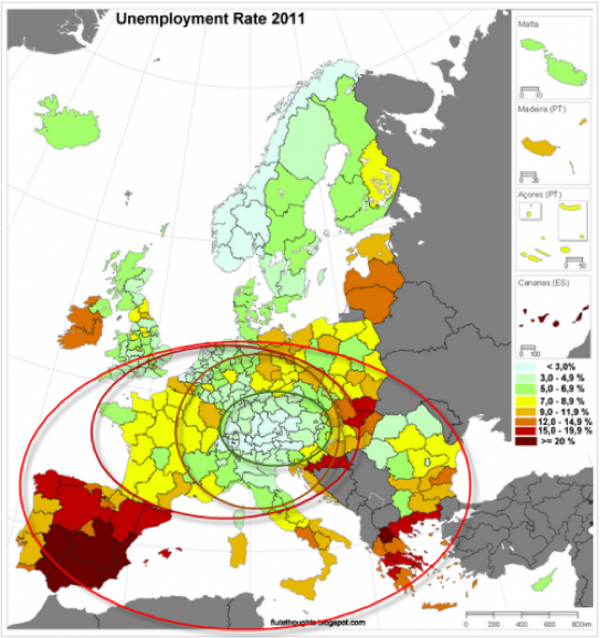
Purchasing managers all over the world are backing off ... numbers below fifty for the Purchasing Managers Index signify economic contraction.


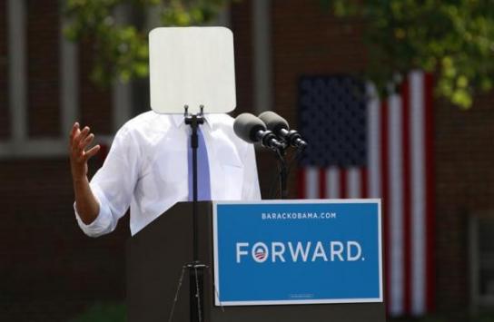
Here's where Clint Eastwood gets his number for unemployment.


The employment to population ratio pretty much sucks.

Although it may be forming a bottom ..... one hopes.


What's up with this?

That's the new economy at work ..... so to speak.

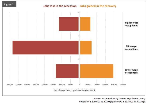
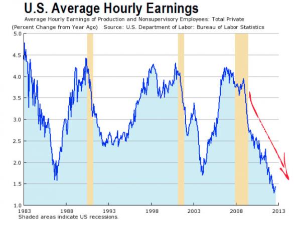
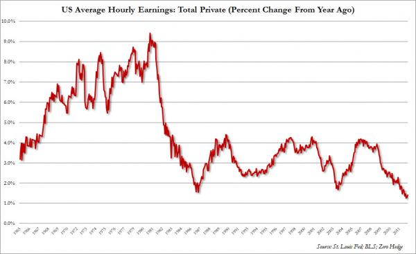
Service jobs are what we do around here now days.


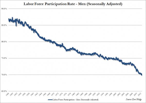
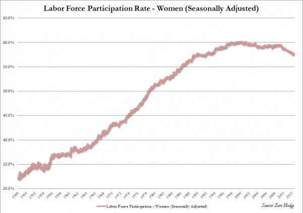
1948 to the present.


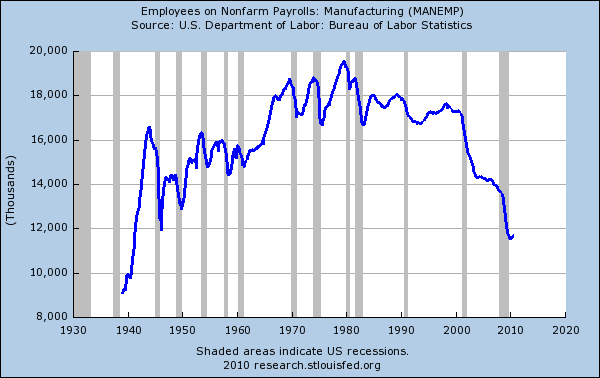
Dirty manufacturing is out of favor, construction is smashed.

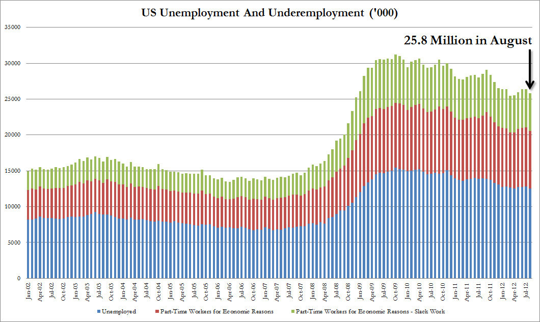
Look closely here, these are total numbers not percentages.

Adjust this horror story for population growth and think it through.

In our opinion, you are looking at the single most profound unintended consequence of kneejerk green/liberal/progressive othodoxy of them all.


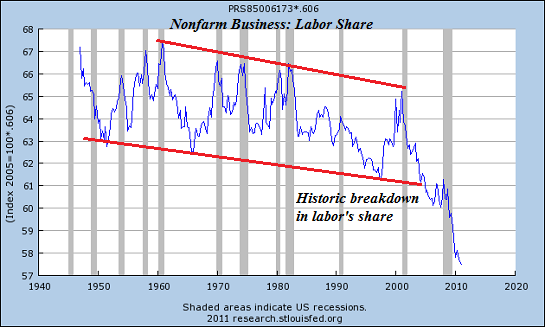
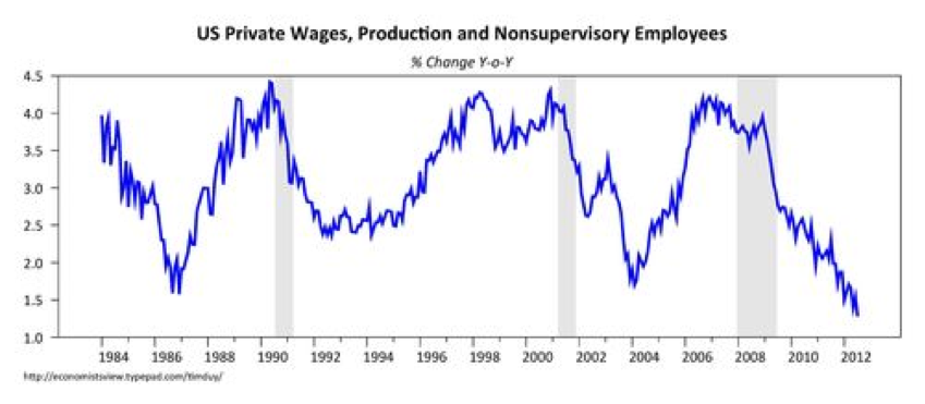
As a result, Labor's share of GDP is at historic lows as all those new bartender jobs just don't pay.


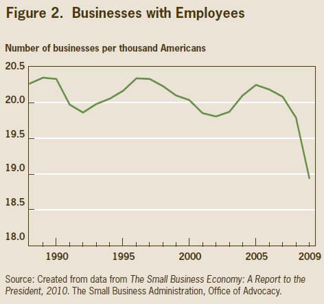
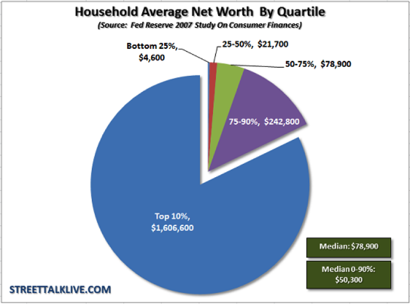
It gets worse if indeed small business is the engine of job creation.


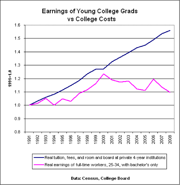
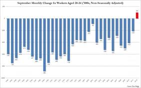
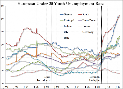
This next one suprised us as we would have guessed the suffering extended across all age groups.


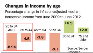
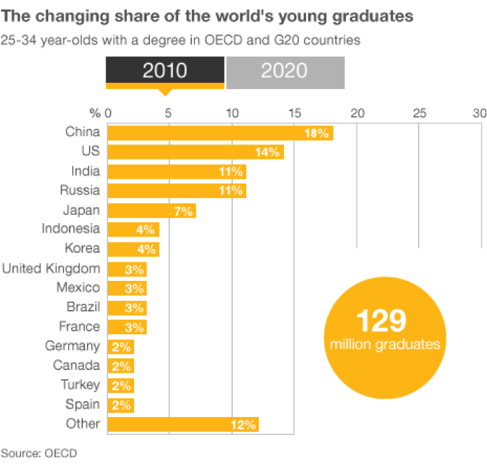
College just may not be that ticket to a better life.


We can't find the piece that defined the word young in this chart.


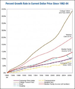
The most common complaint with regards to inflation ... at least among those that that we hear ... has to do with the increasing price of medical care.

The price inflation of a college education blows medical inflations's doors off.

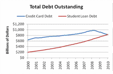
As a result, total student loans exceed credit card debt for the first time in history.

As an aside, student loans can't be extinguished in bankcruptcy since the Consumer Bankruptcy Reform Act of 1998.


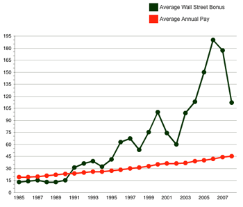
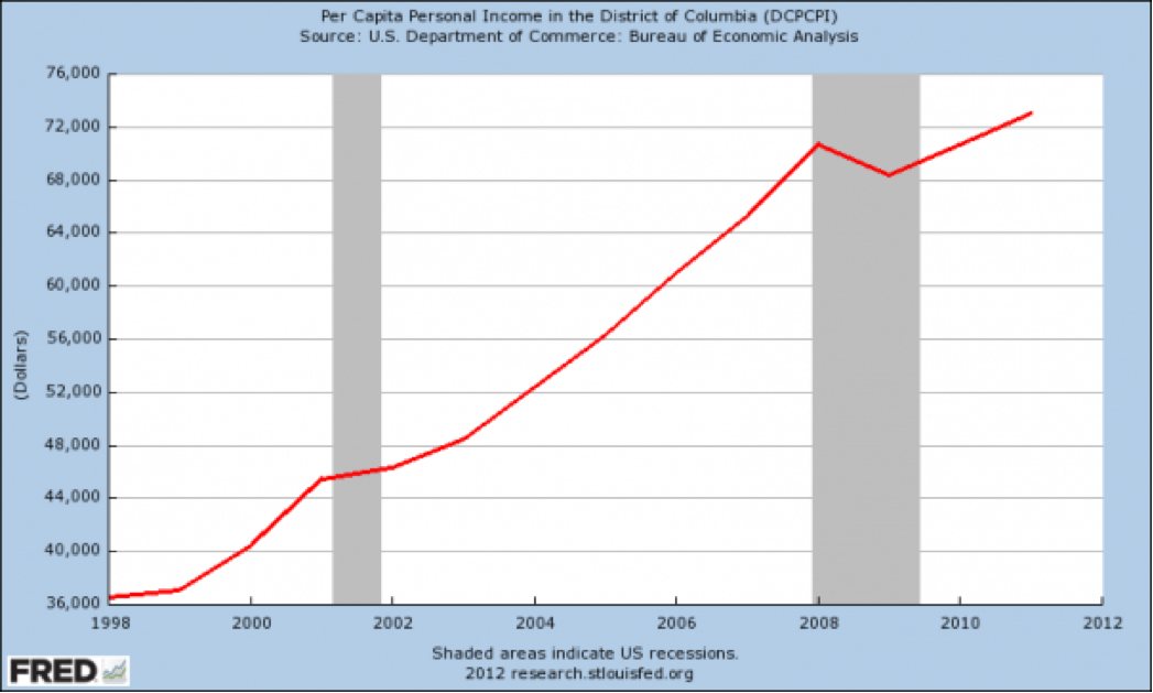
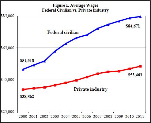
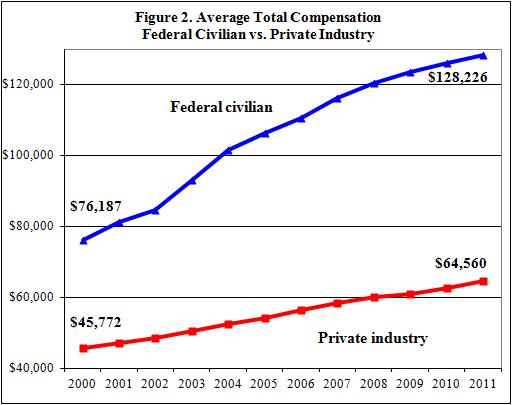
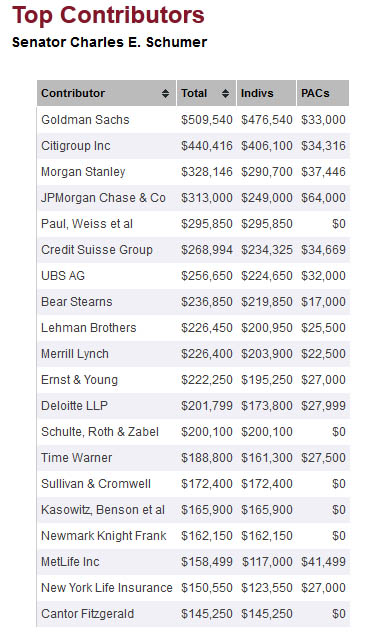
Not to worry, those scamps on Wall Street and in Washington are getting theirs.


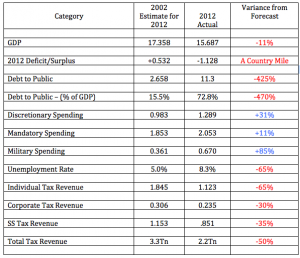
Speaking of Washington, the next time one of those highly paid professionals at the Congressional Budget Office whips out a projection in your vicinity, just reach out and slap that bastard.


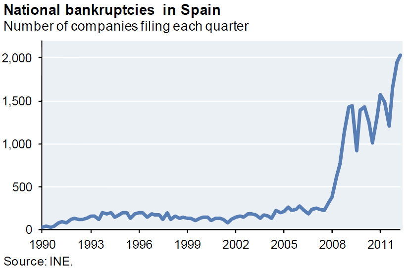
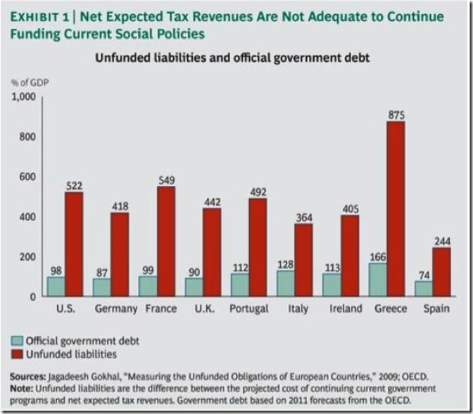
Speaking of bankruptcy.

Coming to a country near you?


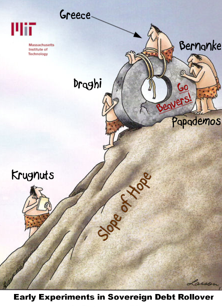
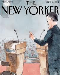
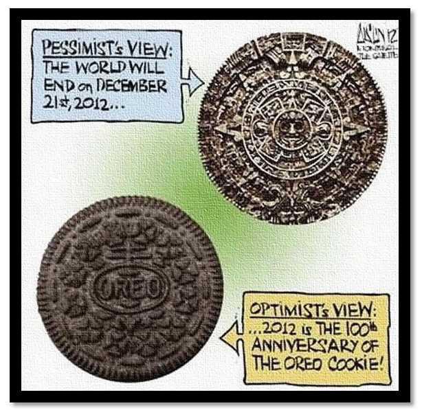
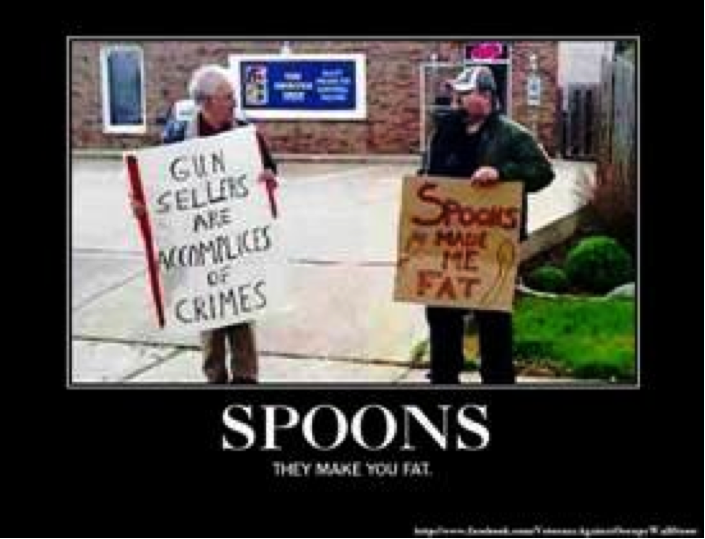
Evidently the cartoonist here is not crazy about economist Paul Krugman.


On a completely different subject, from John Cole.


Hurricane Isaac has a silver lining

Submitted by Roanman on Wed, 08/29/2012 - 08:47


Here's Jim Cantore, among others, performing the obligatory weatherman vs. hurricane story, this time for MSNBC.

Jim like many television news professionals is clearly not bright enough to come in out of the rain ..... just sayin.


From the Weather Channel.

This is the thought to be path of Isaac as it moves inland.


Which should help a great deal with drought conditions throughout the country.


Although it is way too late to help out much with rising food prices anytime soon.

Below are the weekly charts for corn, soybeans and live cattle in that order fom January 1994 to the present.


Sometimes a whole mess of charts, along with a map maybe, is all you need.

Submitted by Roanman on Sat, 08/25/2012 - 09:00


For some reson we were buried in charts this week.  Having junked a dozen or so here are those that we deemed to be the most useful.  I didn't link anything up to the piece we took it from as these charts are mostly pretty self explanatory.

Demonstrating once again that sometimes a chart is all you need.


The 10 Year Treasury Note rate from 1950 to 2011 might reasonably cause you to expect an economic boom the likes of which we enjoyed in the 50s, except for the fact that the velocity of money (the rate at which it circulates through the economy) has fallen off a cliff.


China on the other hand has been busy moving it's money out U.S. debt instruments and into African commodities.

I lied above as the map below does link to the Stratfor article from which it was taken.


Gas prices set an all time high for the third week in August.


Despite the use of ethanol additives.

Just in case you were wondering why your food is getting so expensive, here's one of several real good reasons.


  It ain't all about the drought despite the fact that the drought is both widespread and severe.


Speaking of food.


The Gold market has seen some changes in that the world's Central Banks have become net buyers for the first time in many years.

Demand is down a little over the past 12 months.

You're gonna have to take my word on that last one as I junked the chart.


I wouldn't take a great deal of comfort in this next one as a significant percentage of US Gold holdings are in the posession of the Federal Reserve Bank of the United States and as such have not been audited in generations.


I had the link for this one and managed to misplace it.

I think this chart is for 2011.


The Dow/Gold ratio has plateaued on it's journey to 1/1.

That last part is my personal opinion ..... OK, OK ..... my fondest hope.


 I think these next two speak for themselves although thought to be solutions diverge wildly.


If you ask me here's the real issue.


Meanwhile, those imps over at the Federal Government are loving life.


Sometimes a whole raft of charts .........

Submitted by Roanman on Sat, 08/18/2012 - 07:53


We've been collecting charts again and IMHO have done a slightly better job of adding links this time.

The first, a series of comparisons of California tax receipts, is the one you need to be worrying about ..... or not.

Make no mistake about it, California is Greece, only much, much, much, much ..... bigger.


The public is moving out of stocks as increasingly the stock market resembles a casino.


And are stampeding into bonds where ... IMHO once again ... they are about to get slaughtered ..... see that item on California tax receipts above.


Corn, Gold, Siver and Brent Crude are the best investments of the last five years.


Buy gold ... maybe farmland ..... just sayin.


Mystery solved.


We haven't quite wrapped our brains around this next one yet.

Both charts link to the methodology employed in their construction.


Among the reasons Goldman Sachs won't be facing criminal prosecution for their activities before, during and after the mortgage fiasco ..... or for anything else for that matter.

As an aside, they also own at least one former Democrat Senator and a former Governor of Massachusetts.


Two distinct points of view.


Sometimes a whole mess of charts .....

Submitted by Roanman on Thu, 08/02/2012 - 19:16


We're not linking up the articles tonight mostly because I'm beat and the whole thing pretty much just makes you want to weep anyway.


Online help wanted advertising fell off a cliff in July.


OECD=Organization for Economic Cooperation.


United States Federal Government Expenditures for 2011 and 2012

HHS=Health and Human Services=Medicare/Medicaid.

SSA=Social Security Administration.  

Treasury=Interest on the National Debt ... mostly.


NAPM=National Association of Purchasing Managers.


Fewer rigs means the Nat Gas supply glut is mostly over, along with way low prices.


Total European Union Unemployment Rate


I know, I know, we're looking high and low for a chart with a happy tale to tell.


Pages

Subscribe to RSS - Sometimes a chart is all you need