The Top 12 Reasons to Hate the Mortgage Settlement

Submitted by Roanman on Thu, 02/09/2012 - 18:36


You probably should just stay away from this post unless you're already crabby.

Go to Naked Capitalism for the last eight.


Here are the top twelve reasons why this deal stinks:


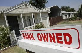
1. We’ve now set a price for forgeries and fabricating documents. It’s $2000 per loan. This is a rounding error compared to the chain of title problem these systematic practices were designed to circumvent. The cost is also trivial in comparison to the average loan, which is roughly $180k, so the settlement represents about 1% of loan balances. It is less than the price of the title insurance that banks failed to get when they transferred the loans to the trust. It is a fraction of the cost of the legal expenses when foreclosures are challenged. It’s a great deal for the banks because no one is at any of the servicers going to jail for forgery and the banks have set the upper bound of the cost of riding roughshod over 300 years of real estate law.

2. That $26 billion is actually $5 billion of bank money and the rest is your money. The mortgage principal writedowns are guaranteed to come almost entirely from securitized loans, which means from investors, which in turn means taxpayers via Fannie and Freddie, pension funds, insurers, and 401 (k)s. Refis of performing loans also reduce income to those very same investors.

3. That $5 billion divided among the big banks wouldn’t even represent a significant quarterly hit. Freddie and Fannie putbacks to the major banks have been running at that level each quarter.

4. That $20 billion actually makes bank second liens sounder, so this deal is a stealth bailout that strengthens bank balance sheets at the expense of the broader public.


I've checked none of this yet as I have plenty of stuff in front of this to make me crabby enough already, but I will.


Fewer young adults hold jobs than ever before

Submitted by Roanman on Thu, 02/09/2012 - 06:51


From CNN Money here's a short but revealing piece.


Fewer young adults hold jobs than ever before.

 February 9, 2012: 5:30 AM ET


The share of young adults with jobs has hit its lowest level since the government started keeping records just after World War II.

By the end of 2011, only 54.3% of those between the ages of 18 and 24 were employed, according to a Pew Research Center report released Thursday. And the gap in employment between the young and all working-age adults is roughly 15 percentage points -- the widest on record.


Sort of makes that 8.3% unemployment figure seem ..... what is the word I'm seeking here ..... fabricated?


A Global History of Debt by Region

Submitted by Roanman on Tue, 02/07/2012 - 19:23


From Credit Loan here's another pretty good infograph.

As always, click on the graphic for a short article that will offer some details the generalities of which you probably already have down.


I love the part about Argentina having reduced their national debt over the past decade.

Default and subsequently becoming an international credit pariah will do that for you.


Charts, Charts and more Charts

Submitted by Roanman on Mon, 02/06/2012 - 18:28


The Bureau of Labor Statistics announced last week the creation of some two million "seasonally adjusted" jobs and a reduction in the rate of unemployment to 8.3%

The press release was breathlessly reported by all the major media outlets across the nation if not the world, none of whom bothered to pull out their calculators and check the number.

The problem with 8.3% aside from the "seasonal adjustments" the formulas for which have never (to my knowledge) been explained anywhere, is the fact that millions and millions ... and millions and millions of Americans of employment age have and continue to be dropped from the count.

For a discussion of how these particular numbers get massaged by the Bureau of Labor Statistics, click on the first chart below for John Williams' outstanding primer at Shadow Government Statistics.

Take note of Mr. Williams calculated rate of about 23% and consider that unemployment during the great depression hit it's high of about 25% in 1933, which number I believe was calculated using Mr. Williams preferred method (the blue line).


The following chart is a simple history of the Fed Funds Rate since 2007.

The second chart is all over the place in multiple formats usually with a notation to note the decline since 1914 when the Fed came into existence with the expressed charge of preserving the purchasing power of the dollar.

The third chart demonstrates the comparable success of the Bank of England in it's pursuit of the exact same charge.


Remember when we were gonna fix that too big to fail thing?


Finally as stated, the total credit market debt owed from 2001 through 2010.


Have a pleasant evening.


Pages

Subscribe to JustThinking.us RSS